
Corkcicle catalogs
Company Corkcicle
Role Senior Designer
Beyond icy (or hot) refreshment: We didn't just create functional products, we curate experiences. We understand the aspirational spirit of our young audience, and our products — from stunning tumblers to innovative coolers — are as fashion-forward as they are functional. Our twice-annual wholesale catalog isn't just a listing of items; it's a vibrant showcase of that brand identity, brought to life with captivating visuals and storytelling.
My role transcended traditional catalog creation. I contributed to the overall brand experience by suggesting themes, collaborating on photo shoots, and ensuring our target audience resonates with the aesthetic and energy we portray. This involvement allowed me to not only showcase our products effectively but also subtly weave in the aspirational lifestyle and trend-setting essence of Corkcicle.

Storytelling Through Visuals
Samples of the photography we produced. This isn't just a collection of captivating images; it's a glimpse into the strategic thinking behind each photo shoot. Every frame resonated with our brand identity and target audience. From product colors and patterns to seasonal themes and influencer collaborations, each shoot was meticulously planned to reflect the unique marketing vision we conceptualized as a team. This meant going beyond aesthetics and delving into storytelling, crafting visuals that evoked emotions, sparked aspirations, and ultimately translated brand messaging into impactful imagery.
2019 catalog cover and sampling of interior pages


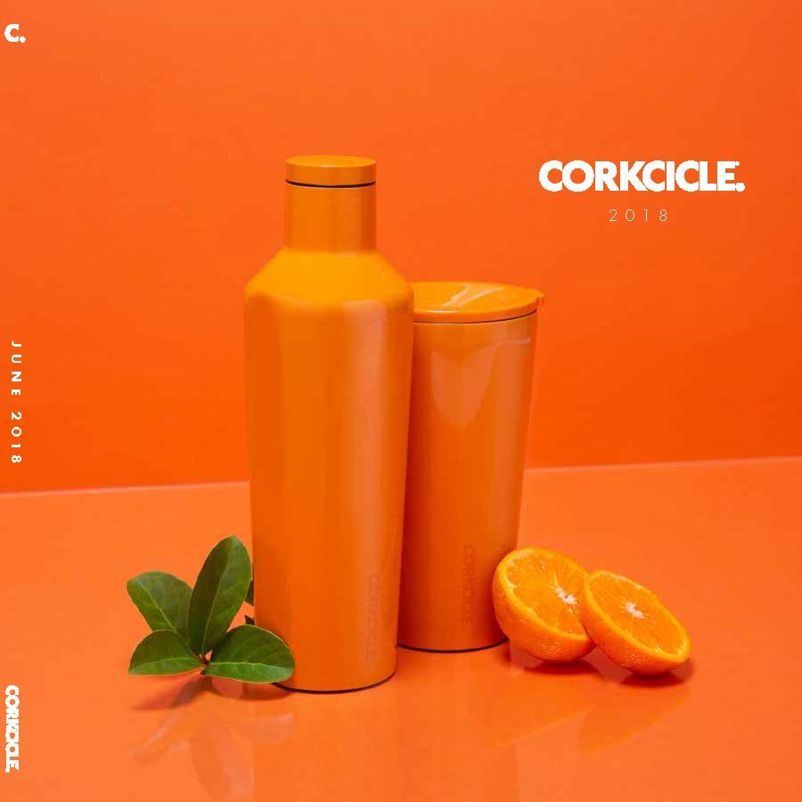
2018 catalog cover and sampling of interior pages

Wholesale price catalog cover and sampling of interior pages

Design expertise meets data management
While wholesale catalogs showcase vibrant imagery and brand stories, price books play a critical role with their focus on buying details. In my role overseeing their production, I demonstrated my ability to navigate both sides of the coin – design and data management. From gathering accurate data to customizing prices and size dimensions for different regions like the US, Canada, and Europe, meticulous attention to detail was paramount. This ensured consistency across diverse markets and minimized errors.

Global Appeal, Tailored Palettes
Each cover, representing the US, Canada, and Europe, dons a distinct palette reflecting sought-after shades in their respective markets. Whether it's a bold black statement for the US or a sophisticated gray whisper for Canada, each cover speaks the language of local preferences, aiding sales and recognition while showcasing our commitment to regional resonance.


